Tuesday 26 March 2013

FMP Peter Blake artist research

I like this image because you can really tell that Peter Blake has properly thought about the composition of each and every section of the box. The colours of the section looks compliments the objects what got stored in the section, some of the colours look really warm and caring but then there's are natural colours what looks like it has a rough smooth feeling about it.

This image is a smart image because, it's got a type pop art, figure and animation. With all of these different areas of art it makes a colourful composition work.


Peter Blake studied at R.C.A London in the 1950 which his studies where interrupted by the National Service, which he spent 2 year serving in the armed forces. 1961 he won the first prize in the junior John Moore's art exhibition. He is recognized has one of the leading pop artist, The Beatles recognized his importance as a artist when they signed him up to design the Sergeant Peepers album cover.


FMP Artist Resarch Joseph Cornell

I like this because the colours has a warming, caring feeling to this picture. All the circles are great except the biggest circle because the star sun image ruins the image, would of been better if it's a different sun image.

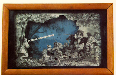
This image has given me a idea for my fmp project, but I will be changing parts of it.

I just like this because of the different materials used it just got that textured feeling to this 3D object.


Joseph Cornell was born December 24, in the year 1903, in Nyasa  New York. From 1917 to 1921, he attended Phillips Academy, Andover, Massachusetts. He was an avid collector of memorabilia and, while working as a woolen-goods salesman in New York until 1931, developed his interests in ballet, literature, and opera. 
In the early 1930s, Cornell met Surrealist writers and artists at the Julian Levy Gallery, New York, and saw Max Ernst’s collage-novel La Femme 100 tĂȘtes. Cornell’s early constructions of found objects were first shown in the group exhibition Surrealism at Levy’s gallery in 1932. From 1934 to 1940, Cornell supported himself by working as a textile designer at the Traphagen studio in New York. During these years, he became familiar with Marcel Duchamp’s readymades and Kurt Schwitters’s box constructions. Cornell was included in the 1936 exhibition Fantastic Art, Dada, Surrealism at the Museum of Modern Art, New York. Always interested in film and cinematic techniques, he made a number of movies, including the collage film Rose Hobart (ca. 1936) and wrote two film scenarios. One of these, Monsieur Phot (1933), was published in 1936 in Levy’s book Surrealism.
Cornell’s first two solo exhibitions took place at the Julian Levy Gallery in 1932 and 1939, and they included an array of objects, a number of them in shadow boxes. During the 1940s and 1950s, he made Aviary, Hotel, Observatory, and Medici boxes, among other series, as well as boxes devoted to stage and screen personalities. In the early 1960s, Cornell stopped making new boxes and began to reconstruct old ones and to work intensively in collage. Cornell retrospectives were held in 1967 at the Pasadena Art Museum and the Solomon R. Guggenheim Museum, New York. In 1970, the Metropolitan Museum of Art in New York mounted an exhibition of his collages. Cornell died December 29, in the year 1972.


Wednesday 20 March 2013

Graphics Evaluation Townscape

In Graphics I have looked at different pictures but I decided to make my own. I liked the gradient look because it made it looked like a watercolour effect with the blended look. if I had more time I would try to make it look more realistic, by putting more detail with the bricks and do the background.

Sunday 17 March 2013

Alexander Calder


Alexander Calder, internationally famous by his mid-3rd, is renowned for developing a new idiom in modern art-the mobile.  His works in this mode, from miniature to monumental, are called mobiles (suspended moving sculptures), standing mobiles and stables. Calder's abstract works are characteristically direct, spare, buoyant, colorful and finely crafted. He made ingenious, frequently witty, use of natural and man made materials, including wire, sheet metal  wood and bronze.
Calder published his book in 1925, Animal sketches , drawn in brush and ink. He produced oil paintings of city scenes, in a loose and easy style. In the early 1926, he began ton carve primitiveness figures in usual woods, which remained an important medium in his work until 1930.


I like this because it reminds me of my own wire sculpture but less detailed. if i was the person I would of tried to make it more 3D. The lips are huge what makes me smile.


This one is okay I don't like this that much. Too me it feels like it is unfinished. If the person put more detail into it I properly like it.


Thursday 14 March 2013

Townscape Illastrator


This is the image what I have have decided to use in illustrator because of the angles of the buildings.


I have used a pen tool for the outline
I have used a series of paints like normal paint and a gradients for the paints for the shade. On the image i have used different line effects for the bricks its was tricky because I wanted it to look like bricks but with a tiny effect.


This is what it looks like without the background 


This is my patterns I did not like using a pattern technique because it's kind of tricky ],

Paintings for townscape


I like this painting because you can see a massive improvement in my painting. the composition of this painting is great. I am most proud of the mixes of the colours.

Wednesday 13 March 2013

Elizabeth Berrien


Elizabeth Berrien is the godmother of the contemporary wire sculpture movement, she was born in 1950. All her life, she had an attraction for animals. As a child she would stretch out on the lawn for hours, studying the goings-on of ants and other small insects. She would gently catch honey bees with her bare hands, hold them awhile, and let them go again. At age five, gazing at the ceiling during nap time, she visualized a long line looping back on it. Picking up two pencils and a ball of string, she invented a crude form of knitting to make a tiny blanket for her pet turtle. The turtle rejected the gift, but Berrien continues to pioneer new uses for fibre.
By preschool, Elizabeth was an avid reader. Her scores for spatial relationships and math were "off the scale;" later she skipped fourth grade. At age thirteen Elizabeth Berrien was admitted to Mensa, the "genius society", where she had a memorable meeting with Buckminster Fuller. As a high school sophomore she came in sixth in a state-wide math competition, against a field of juniors and seniors. Her love for plane geometry and topology were vital to her later explorations of wire sculpture.
In high school, Elizabeth had difficulty expressing her creatively. She could see the energy lines that made animals beautiful, but couldn't translate them on paper. Decades later, she would learn that she was born left-handed. When her efforts at drawing and painting ended in frustration, Elizabeth abandoned all hope of ever expressing herself as an artist.

Placed in a sculpture class against her vociferous objections, Elizabeth came under the influence of a teacher Kenneth. Under his astute tutelage, Elizabeth developed a whole new approach to art - to stop struggling against that which did not work, and start exploring areas which did work. Mr. Curran trained Elizabeth to train herself, using a lifelong technique of creative problem-solving (one good problem, properly solved, should spawn at least ten good new problems).


Curran made Elizabeth class monitor, freeing her from fixed class assignments and stipulating that areas were more satisfactory than works on paper, Berrien was still seeking a comfort zone. At last, Curran gave her a roll of wire, telling her, "Here, kid, take this wire and mess with it". Using wire as a mobile inklines was comforting - if a line wouldn't do what she wanted, she could tweak it around til she liked it better. Berrien still has her first crude wire sculpture, from 1968: Picasso's Cat. Her parents hid it for years so she wouldn't throw it out.


While Kenneth Curran recommended art school to many of his pupils, Elizabeth Berrien was not among them. In his words, "You'd have a lousy time, kid. They'd think you were too obsessive over the wire, and they'd want you to balance it out with all that other stuff that gave you so much grief. Besides, you're a non-conformist. You're doing a good job not being influenced by Alexander Calder, but most college art teachers have a personal mandate to influence the hell out of their students. Just go out there and have a life, the wire will take care of itself."
 Mr Curran past away and even though he has, she still goes to the school to get an insight.

Tuesday 12 March 2013

Townscape Evaulation

My Artist Research where kinda difficult by they fact I was not keen on Townscape Artist but I look at the brief for some help. I learned how to draw perspective shapes and buildings. The thing what I would improve is my drawings on Townscape because they did not turn out has I had thought.

In Textiles the brief told us that we had to make a body supportive structure, so I made caterpillar like with beer mats to represent paving flags. I used a electrical wire so the beer mats could be threaded through to have a layer effect. The artist research who inspired me was Michelle Love Holder by her layering work.

In Photograph I had to make some Photoshop layered images, and para-manic images.  and Double Exposure Images, at start when I got my brief for Photography I thought my Photoshop layered Images where going to be better than my Double Exposure Images but I was mistaken, some of the images turn out better than I have imagined. My para-manic Picture turned out good but still the Double Exposure Pictures are better. The Formal Elements what I mainly Planned was the composition and they where all turned and great. I don't think there's anything I could do to improve my Images.

 In Painting I have painted two paints one just painted and the other painting a collage. The normal painted one is got great composition and the collage painting I tried to focus on colour. I think I have massively improved on my painting, ( I am am really pleased with them both.)

For Printmaking I got some oil paints and rolled it onto a metal tile with a roller. when I was drawing part for my print i got a photocopy of the image and I drawn onto the oil paint. I didn't like my prints because I mist some of the lines in the image. The way that you do it is quite easy to use but I  just don't like the process.  I could massively improve my printmaking images by having all the lines connected up.

In 3D I decide to make a abstract building so I based mine of a para-manic pictures because it's got the measurements of the images. With the measurements I made three different shapes and sizes. I stuck the shapes into place with gummy strip I even put some tubes in to have a different shape in there all in all it turned out great. I don't know what I could of done to improve this.
                                                           

Friday 8 March 2013

Jeff Wall

I like this because of the colour a-bit of contrast in the picture.


Jeff wall received his Ma from the University of British Columbia in 1970, with a thesis titled, "Berlin Dada and the Notion of Context" and did postgraduate work at the Curtailed Institute from 1970-73 where he studied with Manet expert T.J. Clark. Wall was assistant professor  at Simon Fraser University ( 1976-1987) and taught for many of years at the University of British Columbia. He has published essays on Dan Graham, Rodney Graham, Roy Arden, Ken Lum, Stephen Balkenhol, ON Kawara, and other contemporary artists . Many of these texts and collected in the New York Museum of Modern Art

Sunday 3 March 2013

Evaluation Figure

Choosing three different artists to research was quite challenging. I researched different artists and their work on the Internet through Google searches. Some research was also gathered from a book. Primary research includes first hand informant: my own photographs, experiments that I have done and historical documents. Secondary research is second hand information, work that has been produced by someone else. This information can be found in newspaper or magazine articles. Primary research is better because  it is work that I have produced. Secondary research has given me a idea about the techniques and styles of established artists. Research enables me to develop  ideas before I produce my own work. Secondary, artist research, has taught me to appreciate, line, colour and tone. I have tried to build and improve those skills in my own work. By experimenting with different media like; Indian Ink to try it with the tone I just used thicker and thinner lines for my shading. water colour pencils and fine liner, by the way of mixing them together to see how it would turn out.  Most of the art work that I have explored can be found on reliable internet sites. Some art work can also be found in major galleries and have been published in books.

In Photography I used the formal elements to compose my photographs. When I was composing my photos I thought of the camera angles also how the light is responding to the image. The brief told us that we had to create a 6 frame story using photography. I decided to produce a basketball story where someone shoots a basket,  in black and white. We used a film Camera and changed the aperture so it w created depth.  We processed the film in the darkroom using different chemicals (developer, stop and fix and then we took them out and cut them up into strips of 6.  I developed my images  and I mounted them in a row of six.

For the Painting task I used Indian Ink for the tone, but i tried using pen in a certain bit but I messed it up but it did not work out as I had planned. I also used acrylic paint to try and make a skin type painting but it didn't turn out as well as I hoped that is why I did one in different shades of purple and yellows. My Favourite one was my Darth Maul one where I used the red water colour for the skin, yellow and orange water colours for the eyes and a black fine liner for the face paint.

For the Wire sculpture I used wire, spot welders,  pliers and wire cutters the brief said we had to make a portrait out of wire.  I tried different techniques, but the one what really helped me was having a drawing of a portrait of me. I bend the wire around that the drawing. For the hair I made it like a basketball lines, one of the interesting parts is the fact that the nose and mouth has no line going through the middle. I would not try and change it.

For Printmaking I used a plastic cover and and etched with a etching tool, over a portrait of me and started to scratch, into the surface of the perspective cover. After I finished etching my portrait, I got some oil paints and slapped it on so that the paint went into the cracks.  I then wiped the surplus paint from the surface while pressing paint into the scratched part of the surface.