Wednesday 9 July 2014

FAD Home work

This is called Tynemouth Priory by J.M.W Turner in the year 1822. I think the colours work well with the painting because you get the contract on the strong blue of the ocean to the blue of the soft blue of the sky. I think the composition of the painting works well with the colours by the raging waves and the monument in the background, I also like the ships are reacting with the raging waves I think it's the most interesting thing with this painting.
Turner uses water colours and print making, when I saw the painting I thought the painting was going to be a oil painting but I did a little research and found out it was a water colour painting.

This is where I got my picture from
 http://blackburnmuseum.org.uk/wp-content/uploads/2014/03/Tynemouth-Priory-by-Joseph-Mallord-William-Turner.jpg
and this is the website what I got my little bit of information from
http://www.william-turner.org/


This painting is called " The Battle Of Jutland by Charles I like this because they are so much action in this painting with the dark colours of the smoking battleship but the white of the splashing water breaks up the darkness.
I think the composition of this painting works the best by the fact you have different levels of smoke by the light to dark, don't forget about the bomber in the corner makes it amazing by it being in the distance so you don't notice it as much compare to the battleship. This painting was a war memorial to the Darwen corporation, I didn't knew what type of media this was so I looked it up and found out that it was a oil on canvas piece.

This was on the frame of the painting in the Blackburn Museum.


http://www.thepcf.org.uk/artdetective/propose-a-discussion/painting/the-battle-of-jutland

Tuesday 22 April 2014

FMP Bob Martin

This photographer is called Bob Martin he takes sports the series of picture are from the Olympics and the special Olympics.
With this picture I like how he caught the swimmer above the water and all the water splashing about.


I like this because of the amount of depth of field and the Olympian is focused with everything else is blurred.


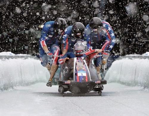
I like this with the composition of this image where you can see the bob slay and the walls of ice, I also like the snow in this picture.


This is Usain Bolt you can tell this buy his colours of his outfit his golden shoes, you can tell that he is running. I like the massive vain in his leg.


I also like this one because of the facial expression of Usain Bolt.


The reason why the top pictures are larger that the others is because they are my favorite ones.


I like this because of the shadow it looks like her shadow is doing a gym exercise and the calf muscle has an amazing shade from light to dark.


The composition of this piece reminds me of what I could do it looks like one of the easier works what he has done.


I like this image because of the four horses in mid air jump, and the hay as well swooping over the camera.


I love the colours in this image it's done with the cyclist going so fast that the camera caught him focused and everything else is blurred.


Monday 24 March 2014

FMP Jasper John

I like how Japser John used the same three colours in his work with the over laying more American flags on top.


I don't know if this is Jasper John;s work but you can tell the person who made this piece of work was inspired by Jasper John,


I like this piece because of the dark background brings the paint brushes out. The Brush strokes in this work is very expressive.

Wednesday 19 March 2014

FMP Leonardo Da Vinci

By the researching on Anatomy I thought of Researching Leonardo Da Vinci because of his Anatomy drawings. I like the shoulder drawing on the top right corner by the shading. The neck is very interesting.


I like the shade in this drawing because of the shading around the muscle lining.


I like where it shows different drawings but in different angles but it also show the detail in the muscle. I like the mini drawings of the neck what's above the drawings of the shoulder and arms drawing.


I like this because of the mixture of bone and muscle I like the idea of that but it will be very confusing on how to actually draw it.


I like the definition in the arms especially the one where the hand goes the right because of the shading and many layers of muscle as well.


This is one of his Anatomy drawings of a hand what I like because of the bones with the skin with the image.


I put this in because I honestly just like it, with the shade and it reminds me of what I drawn in the first couple of weeks on my level 3 course.


This is another one with the muscle tone what it looks unreal.


FMP Anatomy

Im starting to research about basketball so I thought be best of researching about anatomy because of all the muscles and how it works.

This image shows the bones and the muscles so I thought that looks amazing.


I like this because it show what muscles is what and labels it.


I thought it will be good to get some front and back images I like the shade between the arms.


I thought this where good where it shows the muscles tense and everything.


I think this is better because it shows the front back and sides, but the muscle is more detailed.


Friday 7 March 2014

Meetings and connections evaluation

For Meetings and connections

I developed a Family tree based on the maternal side of my family.  Then I did portraits of family members such as my Grandmother, Mother and Cousins. I did drawings based on photographs then with my Grandmother I used different media such as fine liner and charcoal to develop the work.

I also did a portrait of my Mother and also made a mixed media piece, using tea and coffee to express how old she is.

I did some research on Lino print artists and artist's research on Andrew Hunt, Francis Spalding and Nick Waplington, this research gave me some ideas of how to develop work.  I find Nick Waplington's use of fixtures and fittings, in a domestic background, interesting and Jim Spencer's technique of carving in different directions to create his work.

Using my original family portraits I produced Lino prints, which I liked so much that I decided to make some Dry-Point prints.

I feel that some of my pencil drawings did not turn out the way that I wanted them to. The end result was that I lost confidence in my drawing ability. Because they are family members, who are special to me, I felt under pressure to produce a good likeness of them.

My audience is formed arounds families and in this case it was my family, but I can't say if they enjoyed my work because, my family would be afraid of upsetting me or lowering my confidence.

Because of the amount of work I have done in my book, I am going to carry on in the same book and try and make my new project link into this work.


Wednesday 26 February 2014

Site Specific

1 )  What is Site Specific art work?
A)  Site Specific art is especially created for that certain place.  This could be for a gallery, a public sculpture, an installation a work of art or in a unique alternative space.

2)   What is Installation art work?
A)  It also has the more specific meaning of a one - off work ( often a large - scale assemblage) conceived usually for more or less filling a specific interior ( generally that of a gallery, a room sized art piece). Installation art can be site specific but doesn't necessary have to be.
The installation specific art work will only work best in that one size place because it was created for that certain place. In the  1970s the term came into common usage, in the 1980s certain artists started to specialize in this kind of work creating a genre of Installation Art. In the 1990s a museum of installation art  was opened in London and in 1994, a book was published entitled Installation Art, claiming that this was "arguably the most original, Vigorous and fertile form of art today. Lucy Jorge Orta's artwork can be moved about like the 'Wrath Of Medusa.' The challenge of moving artwork is to adapt to the place, sometimes it doesn't have to be traditional Art galleries, some pop artists use empty shops.

3)  Why is Site Specific art work potentially more accessibly to audience?
A)  To me the reason why Site Specific is potentially better than Installation art work is because of Site Specific art work could be outside. Site Specific is potentially more accessible to an audience because it links to the place more because of the people and their history, for example, The Angel Of The North

4)  Give 2 early examples of site specific artwork ( include visuals)

A)  Yves Klein "The Void"


I think he tried something simple because back then art was about great paintings with real talent. 
He tried to break the 'Modern Era' artwork and he wanted to go back to the basics, so he created a statement piece to make a statement.  This piece was lets just say a progression from his colour work to the basic white again


Richard Wilson "Oil Wilson"


I think he tried something new with oil what I think he pulled of really well by the refection of the oil

He is interest in to change the mind perception of architectural space. He does this by the reflection and the lighting.


5) Give 4 examples of contemporary site art work
A)

I have chosen to focus on a series of works especially for the 'Turbine Hall' in the 'Tate Modern.'

Ólafur Elíasson, The Weather Project (2004)


He create a atmospheric artwork, usuing a mirror and a giant orange light and a mist.
They engaged with the artwork by having a picnic and also wave the arms around so they can see thems selves as black shadows.


Carsten Holler Test Site (2006)


The design of these slides is all about the experience for the audience. Holler said that he liked the effect of the combination of delight and anxiety that the experience he gave his audience.


Louise Bourgeois-I Do, I Undo, I Redo (2000)


Martin Creed Light on and off

You can tell that this artist got inspired by yves klien because it looks like the void the thing that he changed was that the light flickers on and off.